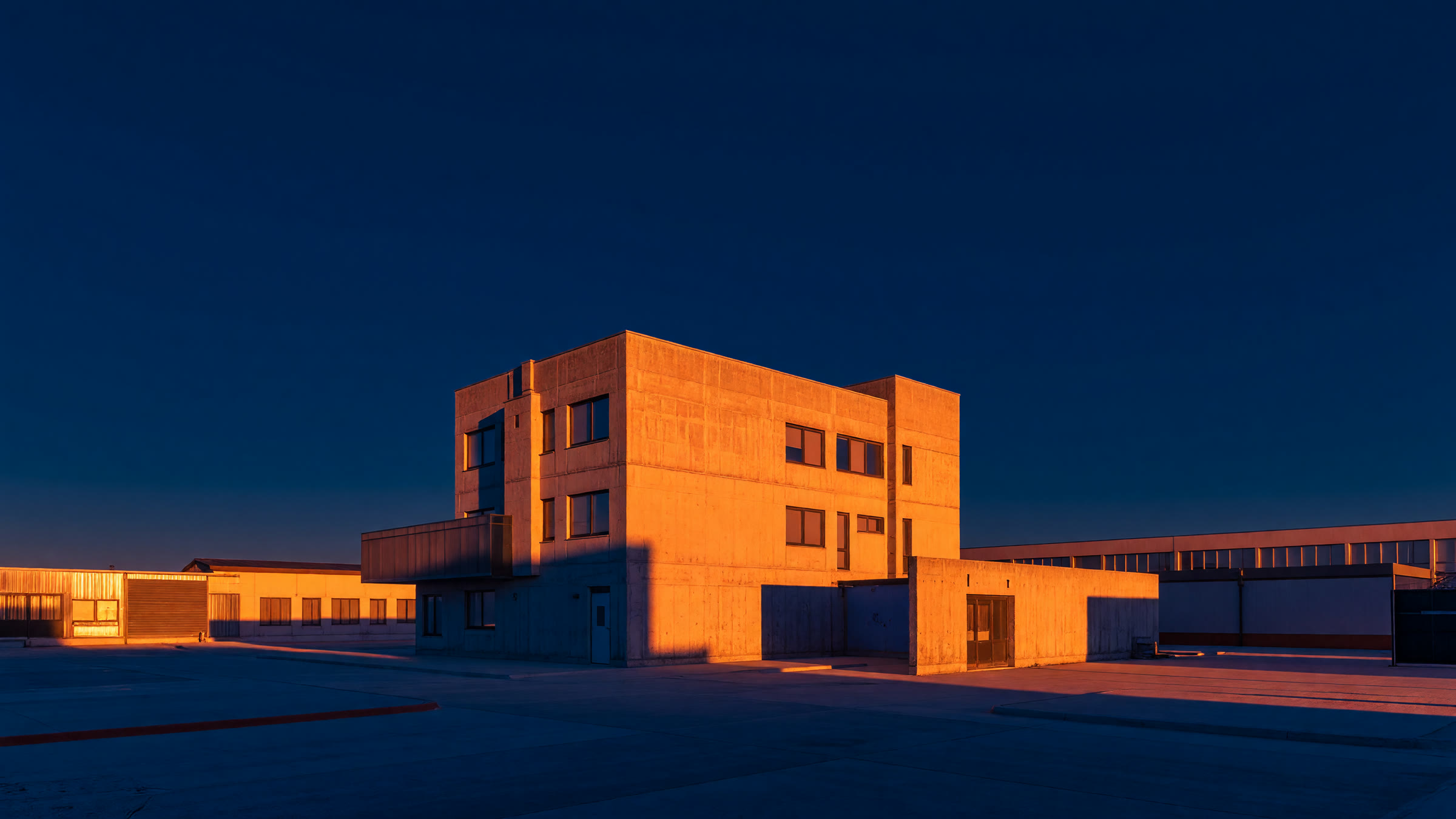
색상환에서 정반대에 있는 두 색만 씁니다. 주황과 파랑이 대표적이에요. 중간색을 아예 배제해야 긴장이 살아납니다 — 초록이나 보라가 끼면 힘이 빠져요
프롬프트
Complementary color contrast: a scene built entirely on orange and blue sitting directly opposite each other, a warm orange sodium-lit building face against a deep blue twilight sky and blue shadows, no green or purple anywhere