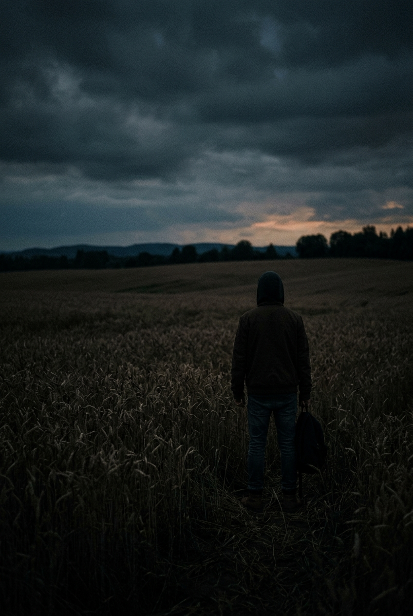
제목을 안 넣은 게 포인트입니다. 위아래 여백을 비워두고 나중에 진짜 폰트로 얹으면 되거든요. 글자를 생성에 맡기지 않는 게 요즘 방식입니다
프롬프트
A moody indie film poster composition, a lone figure in a wheat field at dusk seen from behind, heavy cinematic shadows, subtle film grain, muted desaturated grade with one warm highlight, generous empty space reserved for typography