색으로 분위기 만들기 — 그레이딩 4종 비교

음식 사진을 하다 보니 색이 곧 식욕이더군요. 같은 카페 창가 자리를 네 가지 색 방향으로 만들어 봤습니다.
틸앤오렌지 — 블록버스터
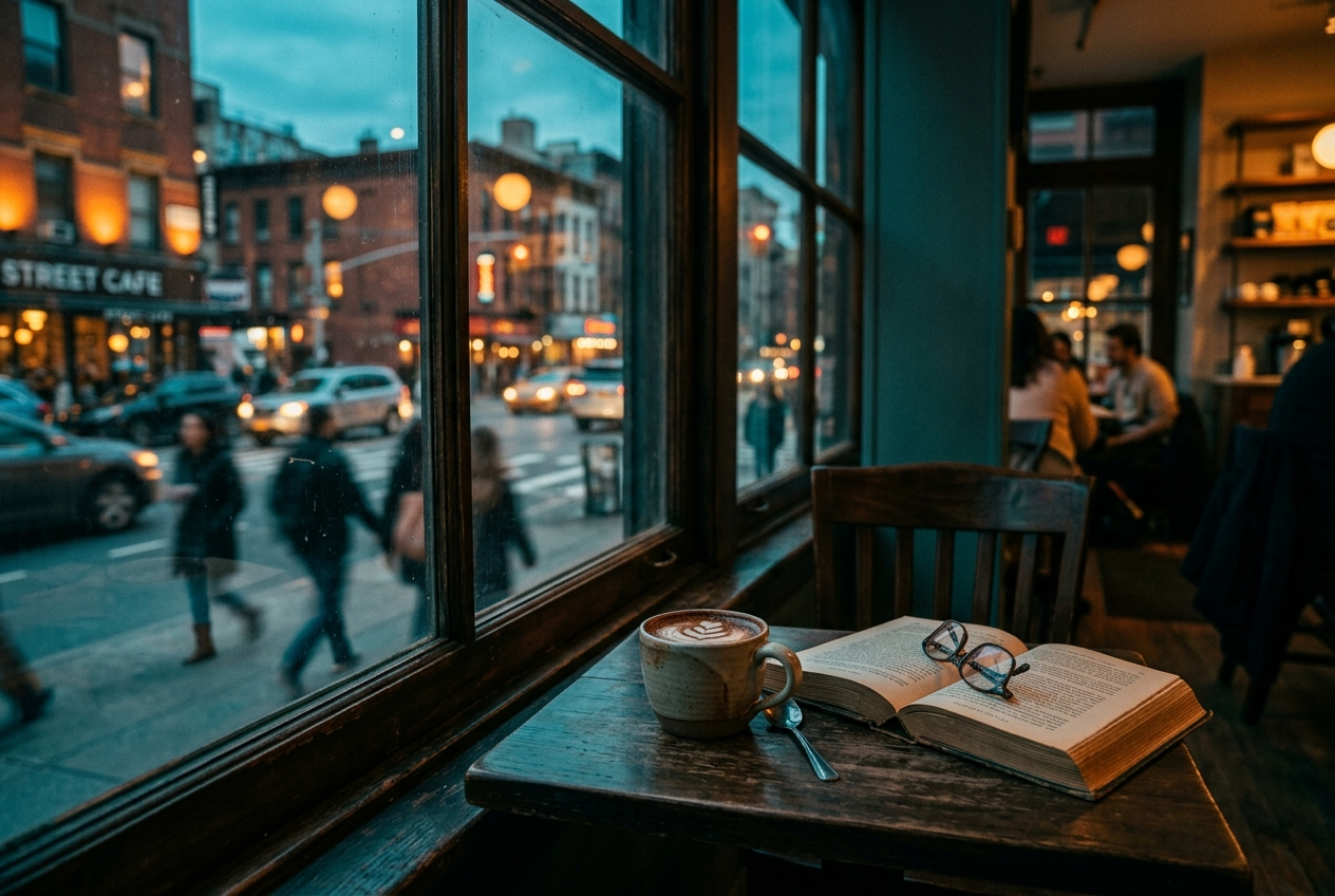
teal and orange grading, cool teal shadows, warm amber highlights — 그림자는 청록, 하이라이트는 주황. 요즘 영화의 그 색입니다.
모노크롬 — 하나의 색으로
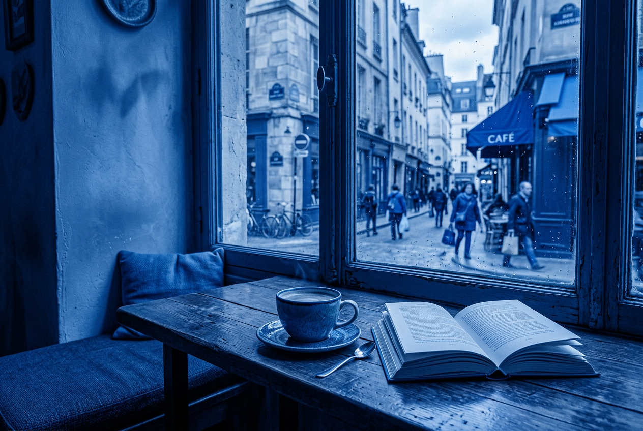
strictly monochromatic blue palette — 색을 하나로 묶으면 화면이 조용해집니다. 통일감이 필요할 때.
하이키 — 밝고 가볍게
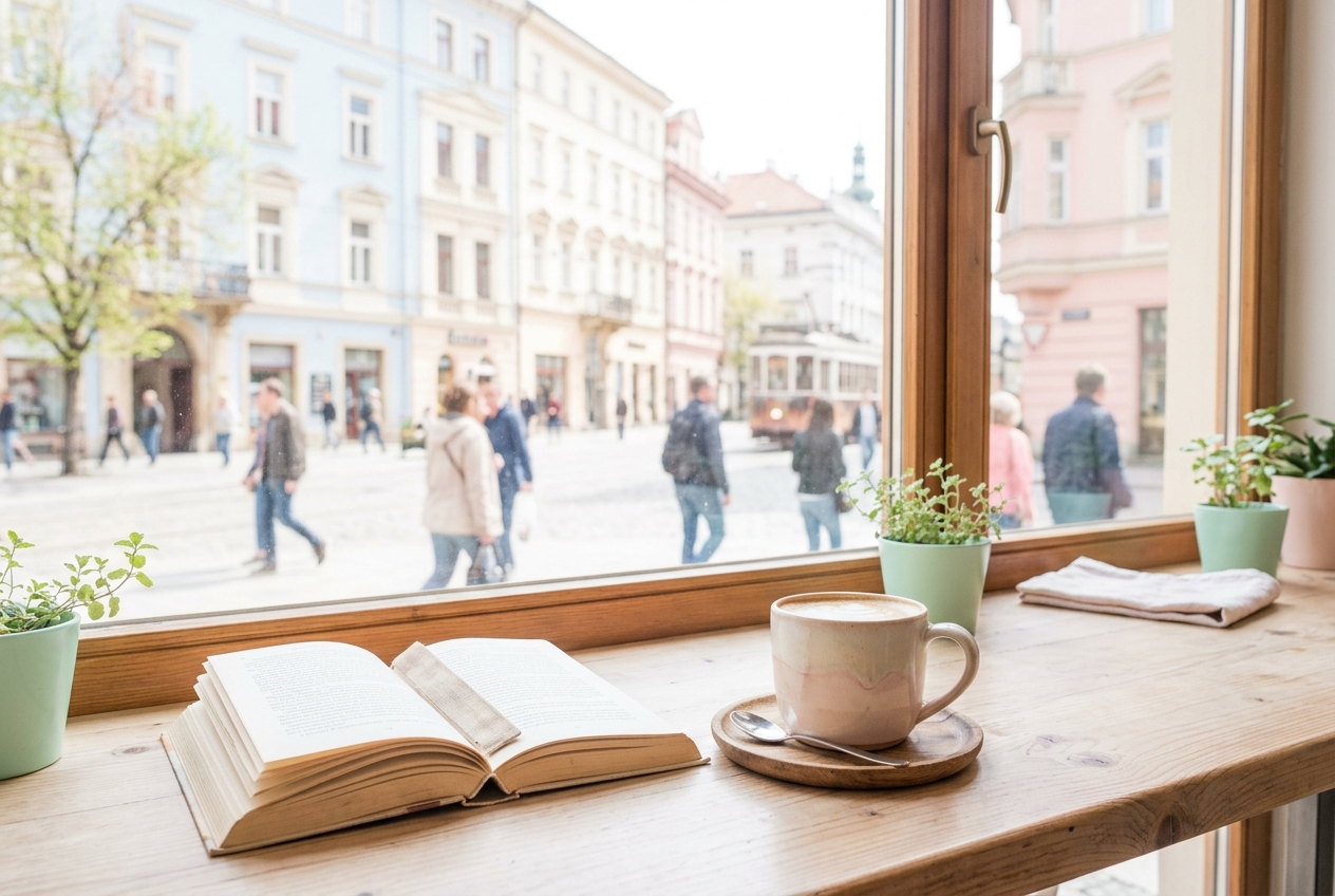
high-key pastel palette, bright airy, minimal shadows — 카페·베이커리·화장품에 잘 맞습니다. 제 미니어처 작업의 기본 톤이에요.
로우키 — 어둠 속 한 점
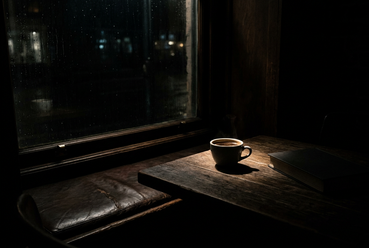
low-key chiaroscuro, deep black shadows, a single shaft of light — 화면의 8할이 어둠이고 주인공만 빛납니다. 커피 한 잔도 이렇게 찍으면 비장해져요.
가장 중요한 함정
색 키워드를 나열하면 오히려 실패합니다. cinematic teal and orange, 8k처럼 쓰면 모델이 이걸 조명 지시가 아니라 스타일 라벨로 읽고 납작한 과채도 이미지를 냅니다.
대신 그 색이 자연스럽게 생기는 상황을 묘사하세요.
❌ teal and orange color grading
✅ warm sodium streetlight on his face, cold blue dusk sky and wet asphalt behind him
결과적으로 같은 색 대비가 생기는데, 후자가 훨씬 자연스럽습니다. 색은 ‘칠하는 것’이 아니라 광원에서 나오는 것이니까요.
색 단어장
muted desaturated earth tones · analogous palette, greens and yellows · duotone, black and hot pink · bleach bypass, crushed contrast · warm color cast, faded blacks, lifted shadows · neutral grade, accurate colors(제품용) · noir black and white, deep blacks